IBM IntelliMagic Vision Time Gaps
Designing accessible data-trust indicators to help mainframe analysts distinguish real gaps from filtered data, system failures, and zero values.

Role
Product Design Intern
Team
2 designers, 1 manager
Timeline
6 weeks (pivoted from Concert for Z to IntelliMagic halfway in)
Problem
No hierarchy in the filter summary and no way to tell blank gaps apart between three states: filtering, system failure, and a zero value.
There were really two problems layered on top of each other: the filter summary gave no consistent hierarchy of information, so users couldn't quickly parse what had changed, and that ambiguity carried straight into the graph. It rendered three completely different data states (a filter applied, a system outage, and an actual zero value) with the exact same visual treatment.
Why did this matter? Because the entire value of IntelliMagic is trust. If a user can't tell the difference between "nothing happened" and "something broke," they either miss a real incident or waste time chasing a false one. Either outcome erodes confidence in the tool.
The PROJECT
Meeting IntelliMagic, a monitoring tool for computer systems, and Time Gaps, an output generated as blank spaces within the IntelliMagic tool.
IntelliMagic is a monitoring tool for mainframes, computer systems that banks and other big companies rely on to process things like transactions, payments, and account records. It tells users what their infrastructure is doing, why, and what to watch out for.
Time Gaps, is the output generated whenever there's a break in the data timeline, shown through both a graph visualization and a text filter summary.
I picked this project up partway through my internship, taking over from an earlier design exploration by Joseph (one of the designers in my team) after being moved between a few workstreams (Multitenancy, Forecasting, and eventually Time Gaps). That hand-off shaped a lot of how I worked.
solution
The final demo!

Getting Up to Speed
Ideating for a solution with no formal research available on Time Gaps.
There wasn't much formal research on Time Gaps specifically only its adjacent feature, Time Intervals, had been documented, and the two are related but distinct. So before I could design anything, I had to build the domain knowledge myself:
Getting domain knowledge
Scraped the IntelliMagic team's folders and past meeting recordings for anything Time Gaps–related
Using AI to look for internal research, and synthesis
Used Bob (our internal AI research tool) to surface existing documentation and ongoing research
Aligning with the team
Met directly with Joseph, Ragini, and Paolo (the design team) to understand the product and the overall data flow
That groundwork surfaced something useful right away: the graph actually needed to solve three distinct problems, not one — which became the backbone of everything that followed.
defining my goals
I started by collaborating with the past designer, aligning on pain points, and unformalized design choices he had made.
I took over the designs from one of the designers to kick-off, looking at current designs, while getting domain knoweldge on the product, how it worked, and the purpose of it.
Goal
Creating trust, confidence, and building retention across IntelliMagic Vision.
Current INTERFACE OF INTELLIMAGIC
This is the existing version, where all blanks are the same, and the user is not able to distinguish between filtering, zero values, & system failures.

Using the interval selection to guide my designs
The filtering feature, Interval Selection, I used it to understand the hierarchy and layers of the text summary filter. Guidng me on what should be shown by default vs. what users deem most important.
Title
Description
Time range
Comparisons
Additional filters
Saved combinations
Presets
Custom
Quick select
00
Commonly used
Day(s) of the week
Time frame(s)
All Data
Today
Yesterday
Last week
This month till now
This month till now
Last Month
This Month till now
Q1
Q2
Q3
Q4
Last Month
This Month till now
Q1
Q2
Q3
Q4
Single Date
mm/dd/yyyy
All Days
Weekdays
Weekends
Monday
Tuesday
Wednesday
Thursday
Friday
Saturday
Sunday
From
00:00
To
23:59
Add
Filters preview
0
No selected items
Currently, the data is filtered as per your organisations default time settings, i.e., xxxxxxxxxxxx.
You can choose filter data with different combinations of time frames and additonal filters.
The preview of your selections will be shown here.
Cancel
Add
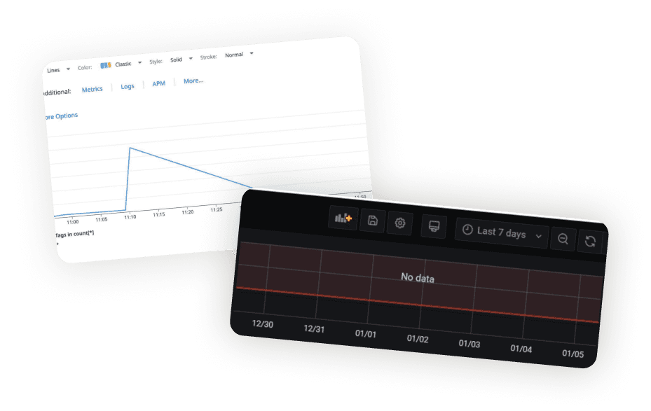
The market
What Grafana and Datadog got right and missed.
Two key insights shaped my approach:
Key Insight 01: Treating each gap type as its own data model
Rather than one generic "empty" state, each cause of missing data got its own distinct visual treatment — the gap itself communicated its cause, instead of leaving users to guess.
Key Insight 02: Implement semantics, not just the visual
The best implementations used plain-language labels visible at a glance, without requiring users to dig into settings.
That second insight directly informed the design principle I carried through the rest of the project which was that every state needs to look different intentionally.
Information architecture
Mapping the filter hierarchy to figure out what the text summary should actually display.
Breaking down those layers gave me a clear hierarchy to design against, what needed to be shown by default versus what could stay secondary, rather than presenting everything with equal visual weight (the original problem I'd set out to solve).

EXPLORATIONS
I needed to explore what visual representations were already familiar to users while integrating scalable designing for those extreme filtering options, especially when all three cases appear simultaneously.
Null values: Represented through dots.


Filtering: shown through actual blanks and gaps within the data. We can see a fragmented line in the bottom right UI. Additionally, semantics to represent that there was no data in the chart.


System outages or failures were represented as fllat lines and also plain-language semantics. I saw an opportunity of exploration, flexibility, and overlap between how I chose to represent outages and filtering.

KEY FLOW
The Final Result
Null Values
Represented as dots on the actual x-axis as that represented zero. Therefore, it was more intuitive to put it on the line rather than on the actual value line.

System Failures and Filtering
Failures represented as red wide gaps as an easy visual cue, as well as an alert icon in the description, when user hovers over the red gap, the hover pop-up, also reveals it in plain-language. While filtering is shown through the x axis, as the filter applies based on the time-frame and ranges, thus, the x-axis adjusts based on that.

Final Flow
This flow demonstrates the user selecting different time intervals, along with how the graph changes.

Semantics to tell the user both visually and plainly what is going on.
System outage has an alert icon
Tooltips to understand different layers providing accessibility and confidence to the user
Zoom-in graph to take a closer look when there are extreme cases of filtering, null values, and system outages.
Easy differentiation between null values, actual filtering, and system failures.
Reflection
Balancing Speed and Learning
I often found myself spending too much time trying to fully understand the domain, its intricacies, the overall impact, before acting, which came at the cost of my progress. My goal now is to deliver proactively while still building a holistic grasp of the product and the problem alongside it.
Harnessing AI Tools
At the beginning, I mainly used AI for research, synthesis, and staying organized, I wasn't yet using it to its full potential to actively create prototypes and interactions. My mentor taught me how to connect our AI, Bob, to other internal tools like Mural and Box. This sped up my process significantly, helping my ideas come to fruition faster and giving me more time for exploration.
Memories
An ode to my co-intern, Angela, my team, Cynthia, Kiko, and Quan, and my my off-shore manager, Jeneé (not pictured)!
They made such a big impact to my experience as an intern in IBM. That sense of community, mentorship, and my intern cohort at iBM made it so memorable, and I’m so grateful that our paths crossed. I loved the speaker sessions, mingling, and the hundreds of prompts with Figma Make and Bob i had to enter!
Cheers! And to end it off, IBM is like oxygen.


